
Jan 25: Mural graphics 2: Lettering | අකුරු | எழுத்துகள்
WORK IN PROGRESS
Intro
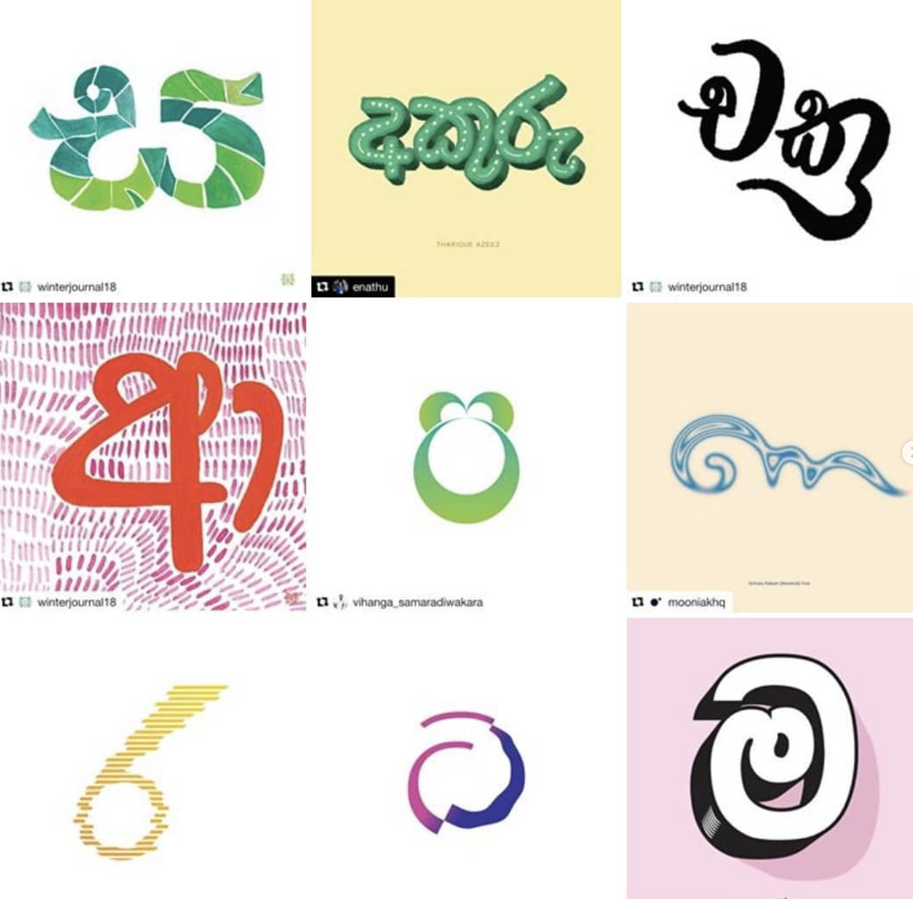
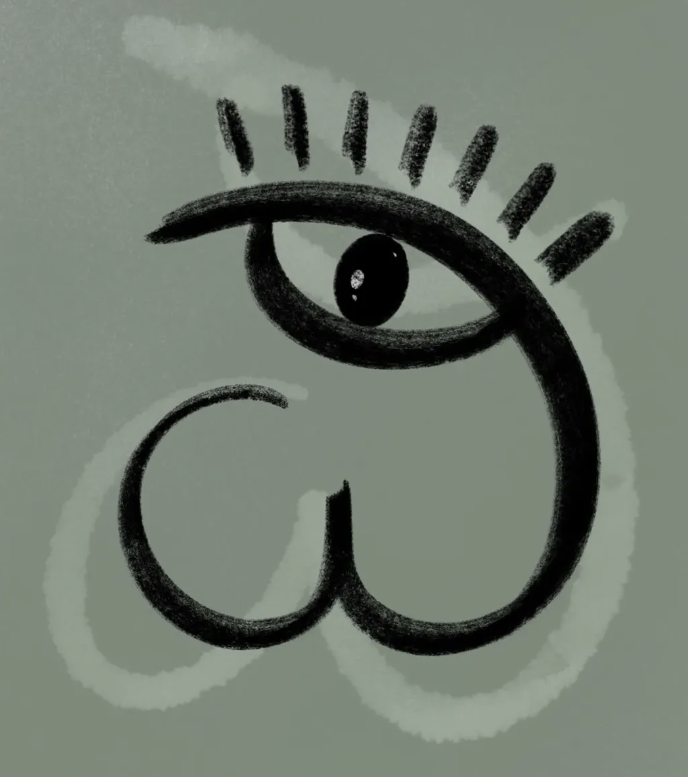
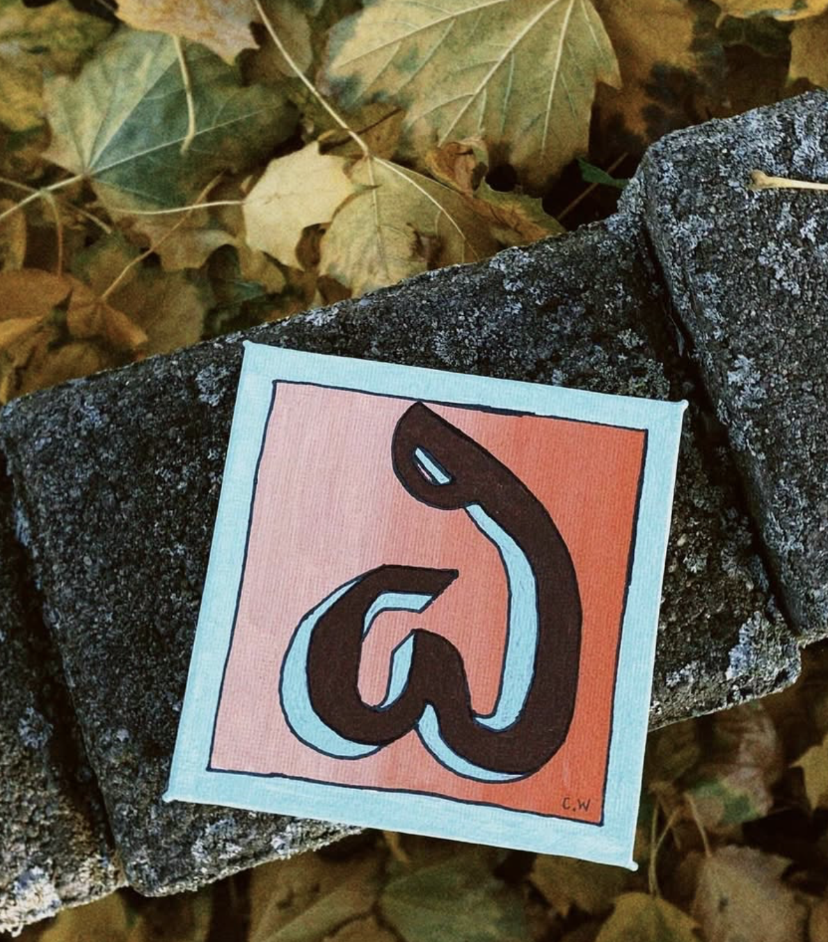
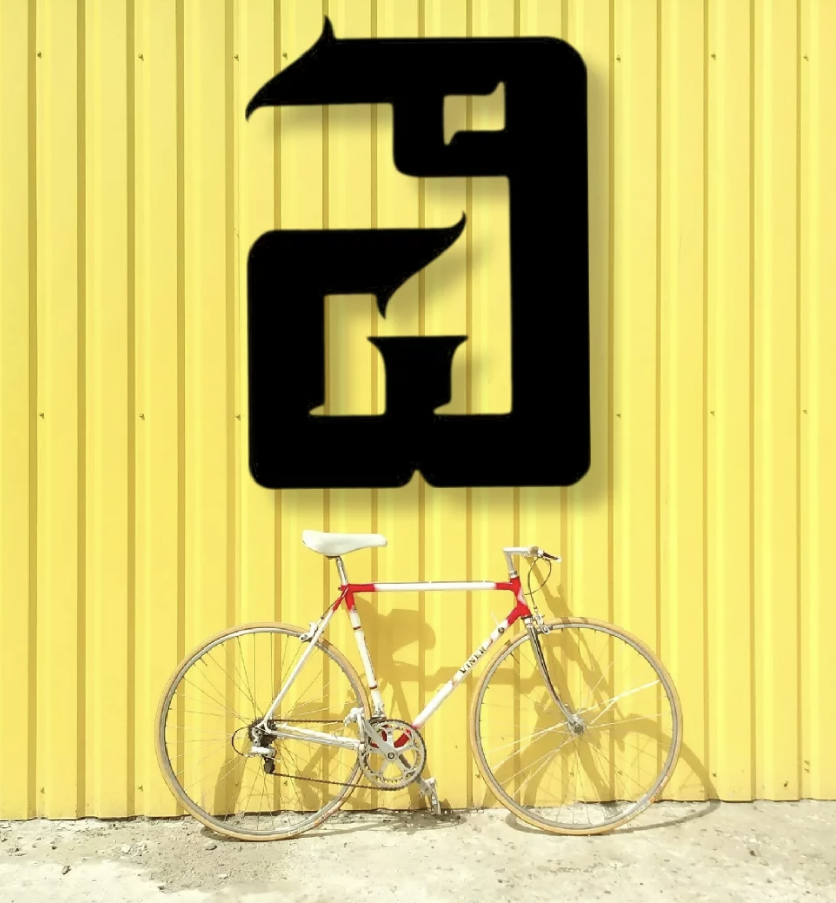
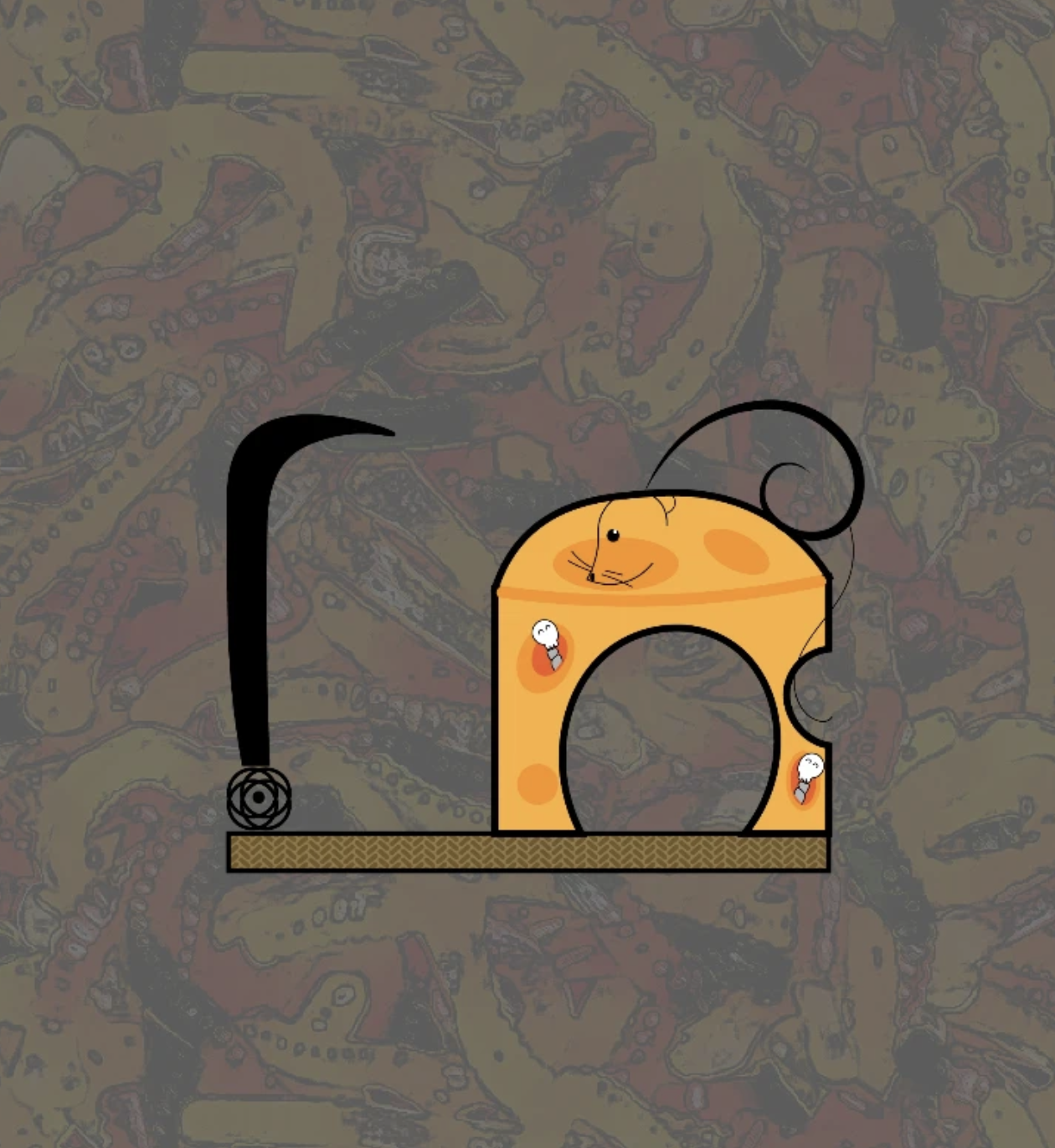
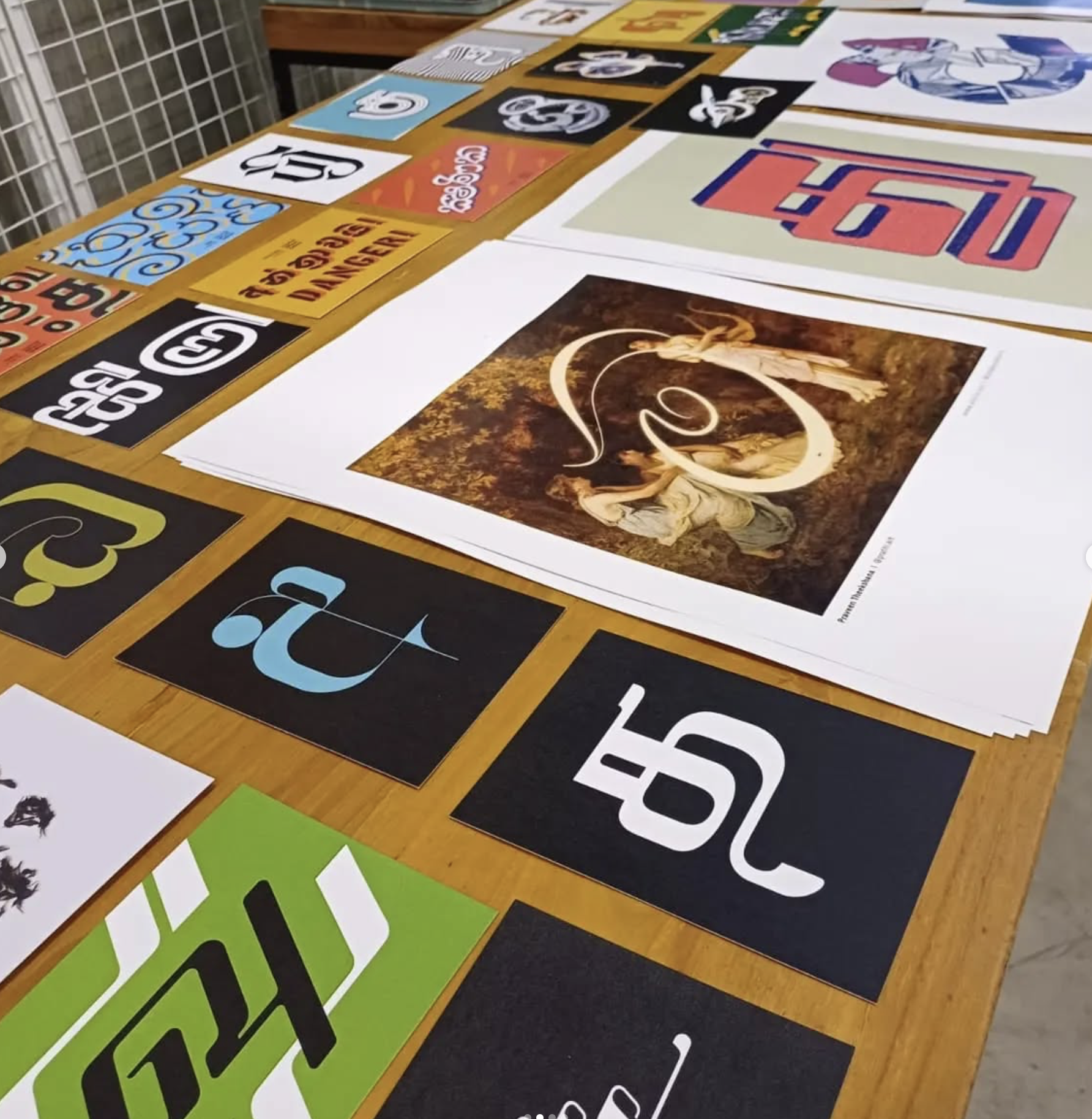
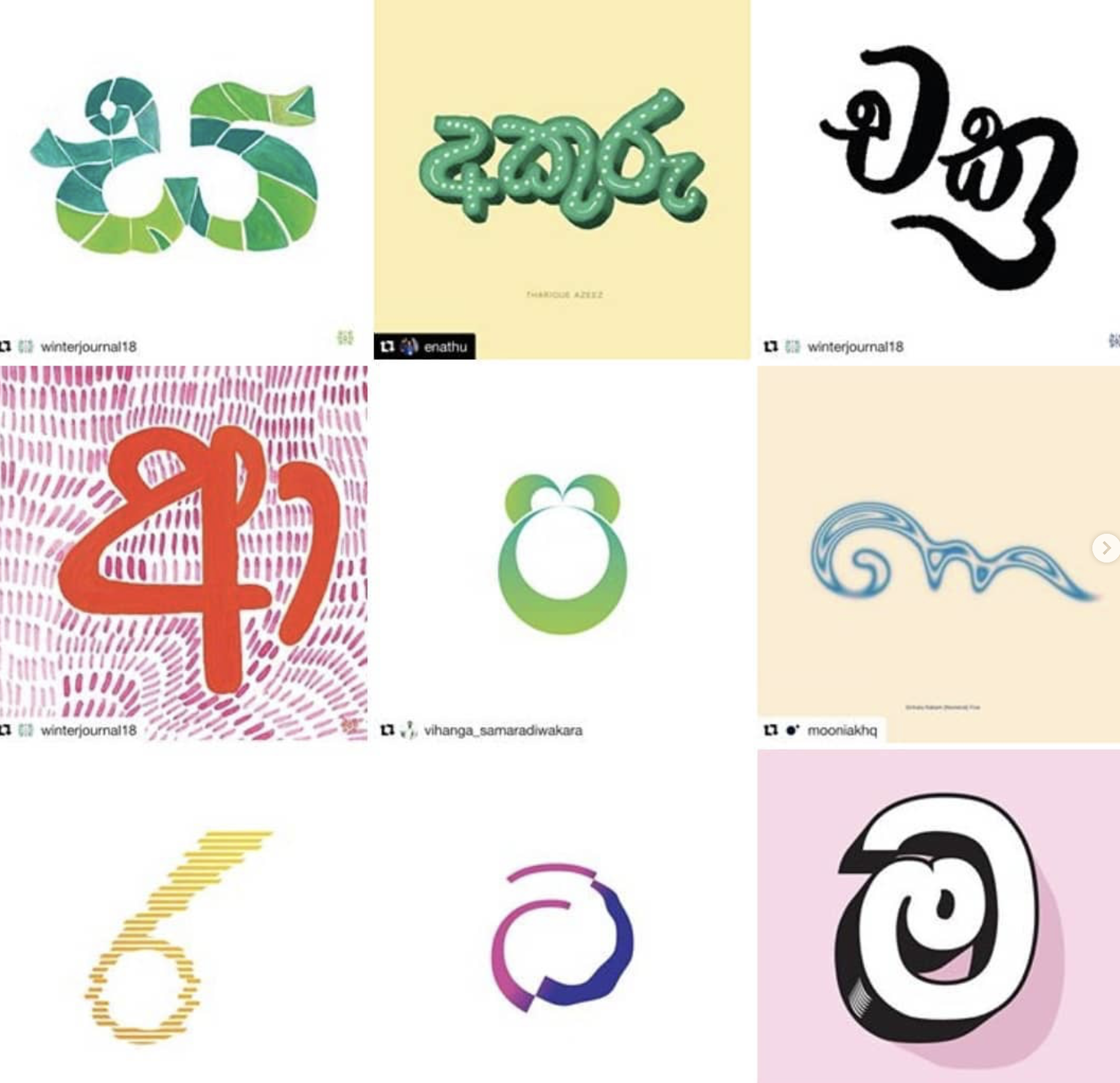
Many of the images in today’s lesson are inspired by a group of artists called Akuru Collective. Imagine these letters as signage for a shop, text in a mural, or a poster—not just something you read, but something you see.
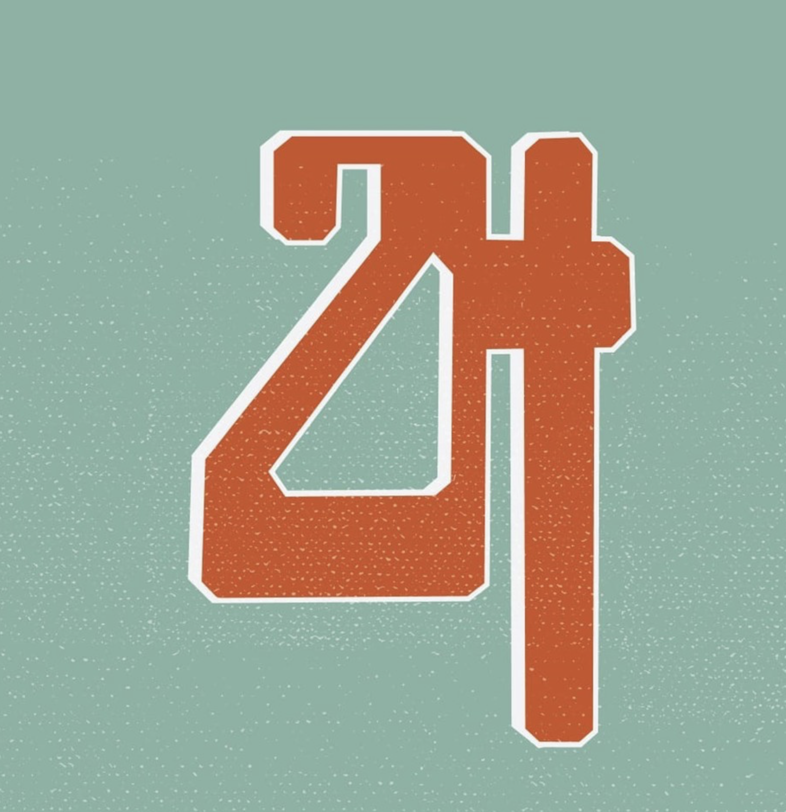
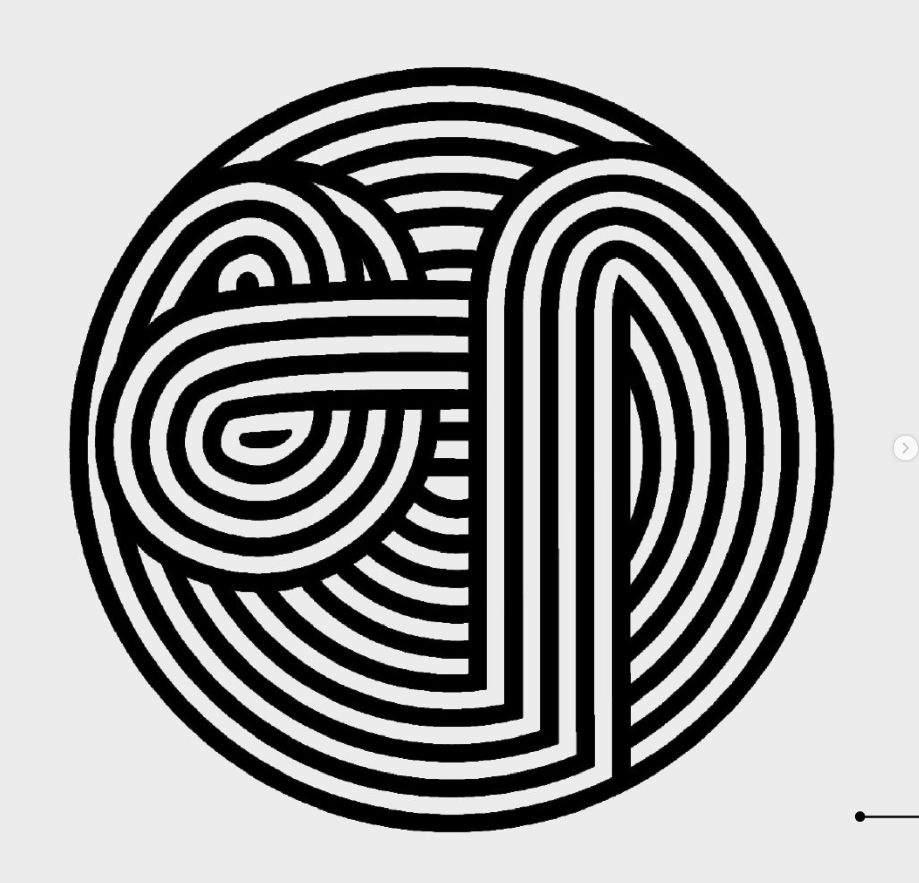
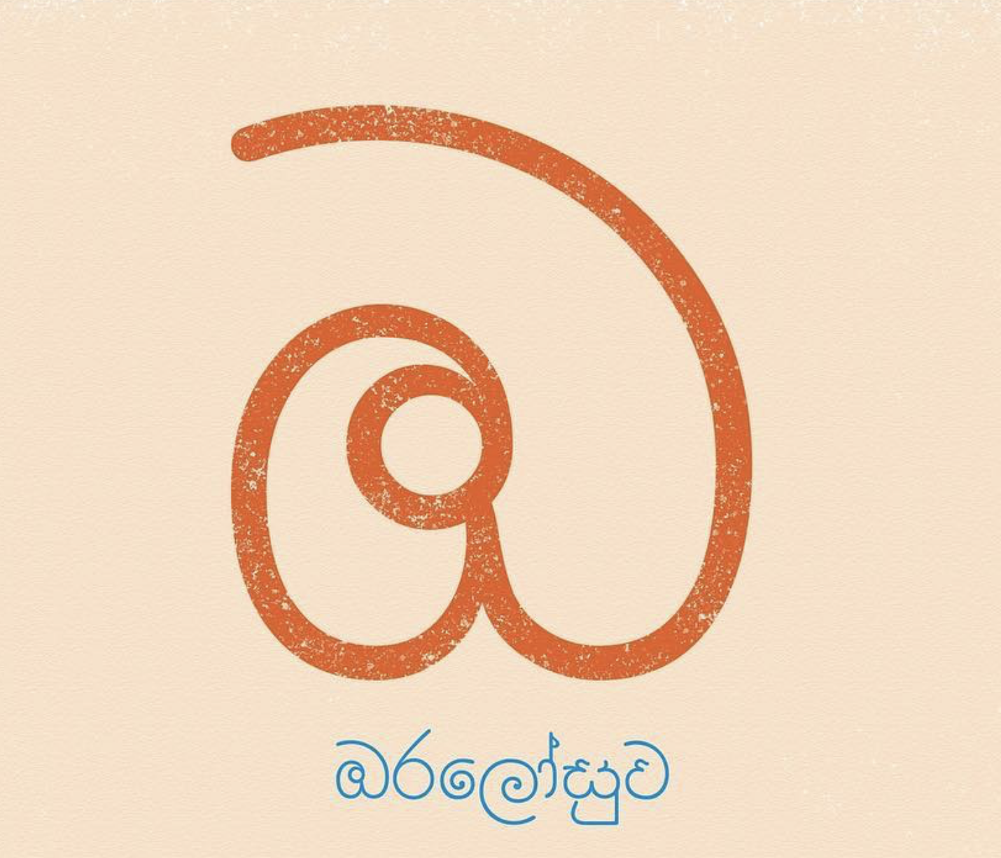
In Sinhala and Tamil, letters are already very graphic—made of curves, loops, and patterns. Akuru Collective shows how letters can:
Show feeling and tone
Change meaning through size, shape, and weight
Be drawings, not just text
Today, we’ll explore letters as visual language.
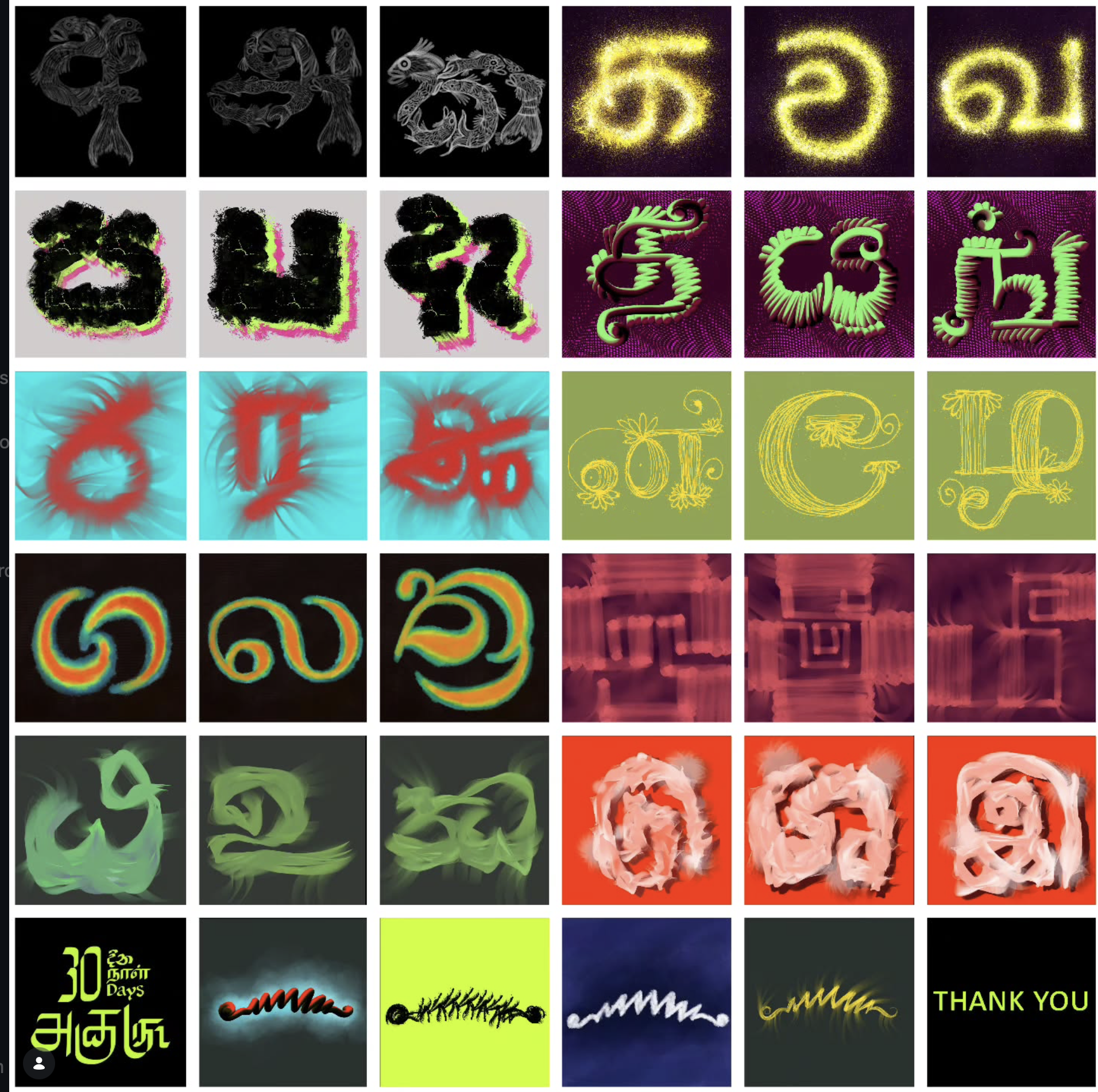
we will focus on 5 letters, and draw it large, with 5 different feelings.
You will need:
Paper
pencil and eraser
paint (optional)
Felt pens
Guide (Play music, but pause every 10 minutes to switch to next letter)
Step 1: 50 mins
Choose one letter.
Draw it five times.
Each time, change how it feels.
Scary
Sharp edges
Uneven lines
Dark, heavy strokes
Tight or tense shape
Fun
Bouncy curves
Rounded forms
Playful proportions
Slight exaggeration
Minimal
One clean line
Even thickness
No extra marks
Calm, balanced shape
Loud
Very thick lines
Large scale
Bold shapes
Takes up space
Soft
Thin or faded lines
Rounded edges
Slow, gentle strokes
Open shapes
Step 2: (15 mins)
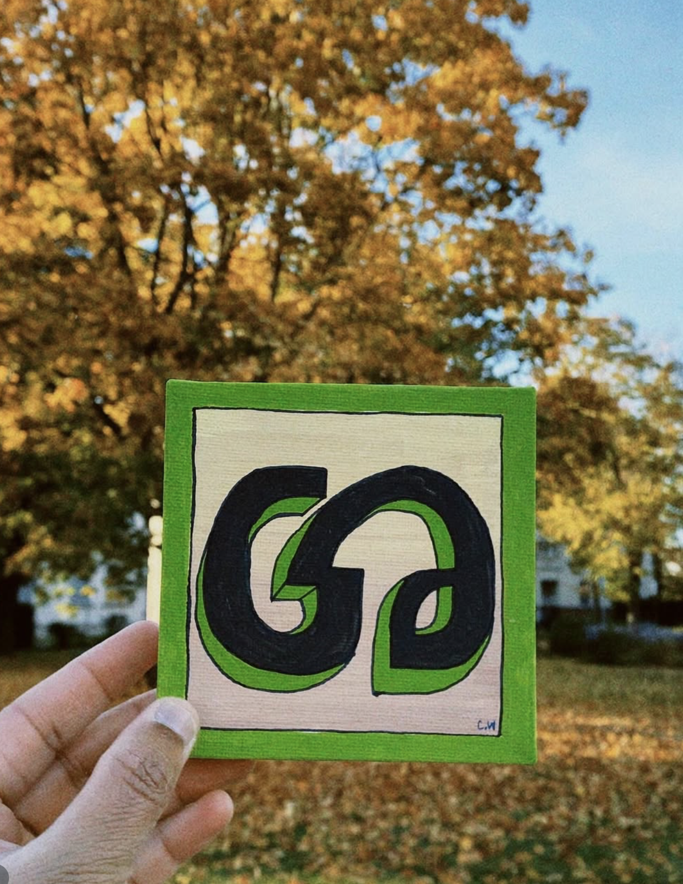
You can try draw a full word using a style of your choice. it can be a sign for the post office, a logo for the children’s center, a postcard, a sign for the shop.
Reflection